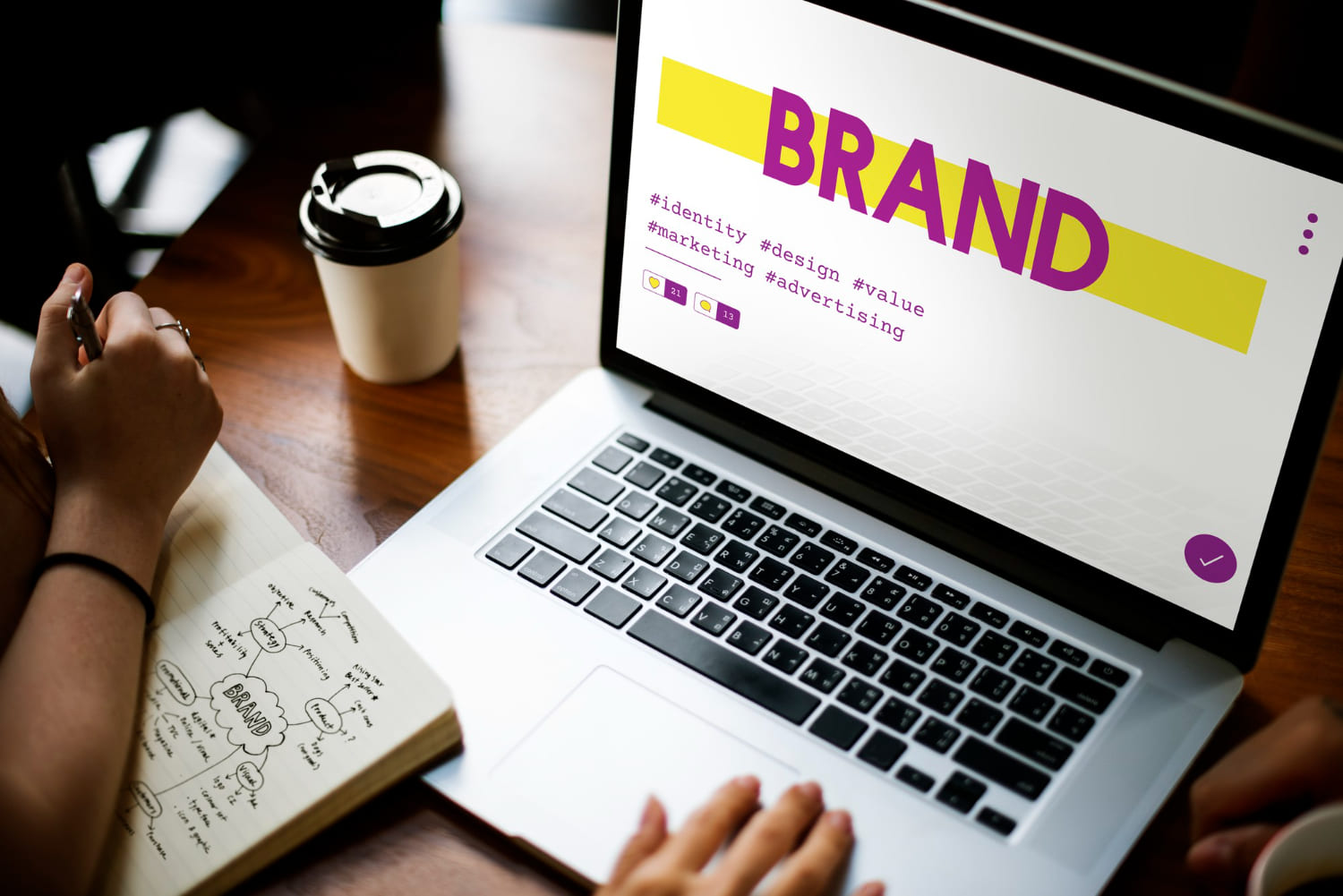
Your logo is the face of your brand – it’s the visual cornerstone that captures your company’s essence in a single glance. A well-designed logo acts as a powerful ambassador for your business, creating instant recognition and leaving a lasting impression on your audience.
Think about iconic brands like Nike, Apple, or McDonald’s. Their logos have become universal symbols, transcending language barriers and cultural differences. These successful logos didn’t happen by accident – they resulted from careful consideration of essential design principles and strategic brand positioning.
Creating an effective logo requires more than just artistic talent. It demands a deep understanding of:
- Brand identity and values
- Target audience preferences
- Design principles and psychology
- Technical requirements across various platforms
Whether you’re starting a new business or refreshing your existing brand, mastering these elements is crucial for logo design success. This guide explores 7 critical points you need to consider when designing a logo that stands out in today’s competitive marketplace.
Each section provides practical tips and real-world examples to help you create a logo that:
- Reflects your brand’s unique personality
- Resonates with your target audience
- Maintains its impact across different mediums
- Stands the test of time
These essential elements will shape your logo design journey and set your brand up for success.
1. Understand Your Brand Identity
Your brand identity is the foundation for your logo design – it’s what shapes every visual element of your business. A clear brand identity helps create a logo that connects with your audience and accurately represents your company’s values.
Your brand’s core values and mission directly influence your logo’s design elements:
- Professionalism vs. Playfulness: A law firm might choose serious fonts and muted colors, while a children’s toy store could use bright colors and fun typography
- Innovation vs. Tradition: Tech companies often go for modern, simple designs, whereas heritage brands prefer classic, decorative elements
- Luxury vs. Accessibility: High-end brands usually have elegant, sophisticated designs, while budget-friendly brands opt for friendly, uncomplicated looks
To define your unique brand identity for logo design:
- List Your Core Values: Write down 3-5 fundamental principles that drive your business
- Analyze Your Competition: Study competitors’ logos to find gaps and opportunities
- Create a Brand Voice: Define how you communicate – formal, casual, or somewhere in between
- Document Brand Attributes: Compile words that describe your brand’s personality
- Consider Your History: Include elements that reflect your company’s background or origin story
These insights will guide your design choices, ensuring your logo truly represents your brand’s essence.
2. Define Your Target Audience
Your logo needs to speak directly to your ideal customers. A design that resonates with teenagers might fall flat with corporate executives – understanding your target audience shapes every aspect of your logo design.
Consider these key demographic factors:
- Age range
- Gender distribution
- Income level
- Education
- Cultural background
- Professional status
Real-World Examples:
- Disney: Their playful, whimsical script logo appeals to children and families
- Goldman Sachs: Clean, serif typography projects stability and professionalism for high-net-worth clients
- Monster Energy: Aggressive, edgy design targeting young, adventure-seeking consumers
Your target audience’s preferences influence:
- Color choices
- Typography style
- Symbol selection
- Design complexity
- Logo placement
Research your audience’s visual preferences through:
- Social media engagement
- Competitor analysis
- Customer surveys
- Industry trends
- Focus groups
A deep understanding of your target demographic creates a logo that not just looks good – it connects with the right people and drives brand recognition in your specific market segment. This understanding is also a crucial part of building a successful brand, as it informs not only the logo design but also other aspects of your branding strategy.
3. Explore Different Logo Design Styles
Logo design styles serve as the visual foundation of your brand identity. Each style carries unique characteristics that can effectively communicate your brand’s message to your target audience.
Wordmarks (Text-Based Logos)
Wordmark logos transform your company name into a distinctive visual element through creative typography and design treatments. These text-based logos work exceptionally well for:
- Brands with short, memorable names
- Companies seeking to build strong name recognition
- Businesses with unique or proprietary names
Notable Wordmark Examples:
- Google: The playful, multi-colored letters reflect the brand’s innovative spirit
- Coca-Cola: The iconic cursive script has remained largely unchanged since 1887
- FedEx: Features a hidden arrow between ‘E’ and ‘x’ symbolizing forward movement
When to Choose a Wordmark:
- Your brand name is distinctive and memorable
- You want to establish immediate name recognition
- Your company name is relatively short (1-2 words)
- You need a versatile logo that works across multiple platforms
The success of a wordmark logo depends heavily on typography selection. Your chosen font must:
- Reflect your brand personality
- Maintain readability at different sizes
- Stand out from competitors
- Work in both color and black-and-white formats
Design Tips for Wordmarks:
- Create custom letterforms to ensure uniqueness
- Consider letter spacing and alignment
- Test different weights and styles
- Experiment with creative elements while maintaining simplicity
A well-designed wordmark can become a powerful brand asset, instantly recognizable across various marketing materials and platforms. The key lies in striking the perfect balance between creativity and clarity while ensuring the design aligns with your brand identity and resonates with your target audience.
Lettermarks (Initials or Abbreviations)
Lettermark logos transform lengthy brand names into memorable initials or abbreviations. This minimalist approach works exceptionally well for brands with multi-word names that might be challenging to remember or display in limited spaces.
Popular Lettermark Examples:
- IBM (International Business Machines)
- HBO (Home Box Office)
- NASA (National Aeronautics and Space Administration)
- CNN (Cable News Network)
Lettermarks shine in situations where space is premium, such as mobile app icons, social media profiles, or small promotional items. You’ll find these logos particularly effective in tech, media, and professional services industries where abbreviated names have become standard practice.
A successful lettermark design requires careful typography selection – each letter must be distinct and legible while maintaining visual harmony. The simplified nature of lettermarks also allows for creative manipulation of negative space and geometric shapes to add unique brand personality.
Brand Marks (Icon-Based Logos)
Brand marks are powerful visual symbols that can convey meaning without the need for words. These logos use images, shapes, and abstract designs to capture the essence of a brand.
Key Advantages of Brand Marks:
- Instant visual recognition across global markets
- Quick understanding by viewers
- Flexibility in size for different uses
- Strong emotional connections through symbolism
Notable Brand Mark Examples:
- Apple’s bitten apple symbol represents knowledge and discovery
- Twitter’s bird embodies freedom of expression
- Nike’s swoosh symbolizes movement and victory
- Shell’s red and yellow shell design has evolved since 1900
The most successful brand marks often draw inspiration from meaningful concepts while keeping the design simple. Target’s bullseye design is a great example – it’s both a literal representation of the company name and a symbol of precision and focus.
Your brand mark can include clever design elements that tell your story. Mercedes-Benz’s three-pointed star represents their dominance in land, sea, and air transportation, while Amazon’s arrow connects ‘A’ to ‘Z’ while forming a smile.
4. Prioritize Simplicity in Your Designs
Simplicity is a key principle of effective logo design. A clean and simple logo grabs attention quickly and leaves a lasting impression on viewers. The human brain processes simple shapes and designs faster than complex ones, making minimalist logos more memorable and recognizable.
Examples of Iconic Simple Logos:
- Nike’s Swoosh: A single curved line that suggests movement and speed
- Apple’s Apple: A basic apple silhouette with a bite taken out
- McDonald’s Golden Arches: Two simple curved lines forming an “M”
- Target’s Bullseye: Two concentric circles in red and white
These logos work because they:
- Can be drawn from memory
- Remain clear at any size
- Work in black and white
- Communicate brand essence instantly
The secret lies in strategic reduction – removing unnecessary elements until you reach the purest form that still conveys your message. This concept aligns closely with the principles of minimalist graphic design, which emphasizes simplicity and functionality.
Think of your logo as a signature rather than a painting. A simple design allows for versatility across different applications and ensures your logo remains timeless rather than trendy.
When designing your logo, challenge yourself to communicate your brand’s core message with the fewest possible elements. This approach creates powerful, enduring logos that stand the test of time.
5. Ensure Versatility Across Different Platforms and Sizes
Your logo needs to maintain its impact whether it’s displayed on a tiny social media icon or a massive billboard. A versatile logo design adapts seamlessly across:
- Digital platforms (websites, mobile apps, social media)
- Print materials (business cards, letterheads, brochures)
- Physical signage (storefronts, vehicles, merchandise)
- Marketing collateral (presentations, email signatures)
Testing Your Logo’s Adaptability:
- Create multiple size variations (16px to 1000px+)
- Test in black and white to ensure clarity
- Check legibility on different background colors
- Review how it appears on curved surfaces
- Examine visibility in both landscape and portrait orientations
Pro Tips for Versatile Design:
- Use vector graphics for infinite scalability
- Maintain a balanced aspect ratio
- Create simplified versions for small displays
- Design alternate layouts for different contexts
- Consider a responsive logo system that adapts elements based on size
A truly adaptable logo maintains its recognition factor across all applications while preserving its core design elements and brand message.
6. Use Colors Wisely in Branding
Colors have a direct impact on human emotions, making them powerful tools in logo design. Each color triggers specific psychological responses that can influence brand perception and consumer behavior.
Understanding Color Psychology in Logo Design:
- Red: Creates excitement, passion, and urgency
- Blue: Projects trust, professionalism, and stability
- Yellow: Radiates optimism, warmth, and clarity
- Green: Symbolizes growth, nature, and harmony
- Purple: Conveys luxury, creativity, and wisdom
- Orange: Stimulates enthusiasm, adventure, and confidence
- Black: Represents sophistication, power, and authority
- White: Suggests purity, simplicity, and cleanliness
The way you combine colors can also enhance your brand message. For example, McDonald’s uses red and yellow to stimulate appetite and create a sense of urgency, while Facebook relies on blue to build trust and reliability.
When choosing colors for your brand:
- Consider the standards of your industry but also strive to be unique.
- Banking institutions often use blue to reinforce trust; tech companies might prefer sleek black or silver; environmental organizations naturally lean towards green.
- Be aware of cultural meanings associated with colors – white may symbolize purity in Western cultures but represent mourning in some Eastern societies.
- Test your color choices across different backgrounds and lighting conditions to ensure they have a consistent impact.
By understanding the psychology behind colors and using them strategically in your branding efforts, you can effectively communicate your brand values and connect with your target audience on an emotional level.
7. Create a Unique Logo That Leaves a Lasting Impression on Viewers!
Creating a memorable logo requires strategic thinking and creative innovation. You can make your logo stand out by incorporating these proven design techniques:
1. Smart Use of Negative Space
Negative space refers to the empty space around and between the subject of an image. By cleverly using negative space, you can create hidden symbols or shapes within your logo that add depth and meaning. Here are some examples:
- The FedEx arrow hidden between ‘E’ and ‘x’
- The Toblerone bear within the mountain
- NBC peacock created through empty spaces
2. Hidden Messages and Symbols
Another effective technique is to incorporate hidden messages or symbols into your logo design. This adds an element of surprise and intrigue, making people want to look closer. Consider these examples:
- Amazon’s smile arrow pointing from A to Z
- Baskin Robbins incorporating the number 31
- The hidden cyclist in the Tour de France logo
3. Unconventional Typography
Typography plays a crucial role in logo design. To make your logo truly unique, experiment with unconventional typography techniques such as breaking letters in unexpected ways, combining multiple fonts strategically, or creating custom letterforms.
Your logo needs to maintain industry relevance while pushing creative boundaries. Study your competitors’ logos and identify opportunities to differentiate:
- Use unexpected color combinations within your industry’s palette
- Experiment with geometric shapes in traditional symbols
- Transform common industry elements into distinctive designs
4. Design Elements That Enhance Memorability
In addition to the above techniques, there are certain design elements that can enhance the memorability of your logo:
- Asymmetrical balance to create visual interest
- Strategic use of white space for clarity
- Distinctive shapes that break traditional patterns
- Visual double entendres that reward closer inspection
Remember to test your logo’s recognition factor with your target audience. A truly memorable logo combines clever design with clear brand representation, creating an instant connection with viewers while maintaining its professional appeal.
Common Mistakes To Avoid When Designing A Logo For Your Brand
Creating a powerful logo requires careful attention to detail and avoiding these critical mistakes:
- Overcomplicated Designs: Cluttered logos with excessive elements lose impact and become difficult to recognize at smaller sizes
- Poor Font Choices: Using trendy or hard-to-read typefaces can make your logo quickly outdated and ineffective
- Heavy Reliance on Color: Logos should work equally well in black and white – don’t depend solely on color for impact
- Raster Images: Always create logos in vector format to ensure scalability across different sizes and mediums
- Copying Other Designs: Mimicking competitors’ logos can lead to legal issues and damages brand credibility
- Generic Solutions: Using overused symbols or clichéd design elements fails to make your brand stand out
- Inflexible Designs: Creating logos that don’t adapt well across different platforms limits their usability
Professional logo designers bring expertise and fresh perspectives to your branding project. Their experience helps navigate these common pitfalls while creating distinctive visuals that resonate with your target audience.
Pro Tip: Consider your logo design an investment in your brand’s future. A well-designed logo serves as the foundation for all your marketing efforts and builds lasting brand recognition.
FAQs (Frequently Asked Questions)
Why is understanding my brand identity crucial before designing a logo?
A clear understanding of your brand identity is essential because it shapes the overall look and feel of your logo. Your core values and mission statement guide the design process, ensuring that the logo accurately reflects what makes your company unique.
How can I define my target audience for effective logo design?
Defining your target audience involves analyzing customer demographics and preferences. Knowing who your ideal customers are allows you to create a logo that resonates with them, increasing its effectiveness in the market.
What are the different styles of logos I should consider?
Common logo styles include wordmarks (text-based), lettermarks (initials or abbreviations), and brand marks (icon-based). Each style has its advantages and disadvantages, influencing recognition and versatility, so it’s important to choose one that aligns with your brand’s personality.
Why is simplicity important in logo design?
Simplicity is key to creating memorable and timeless logos. Simple designs stand out from the competition and are easier for consumers to recognize. Iconic logos like Nike’s swoosh exemplify how minimalism can effectively communicate a brand’s message.
How can I ensure my logo is versatile across different platforms?
To ensure versatility, test your logo’s adaptability across various mediums (digital vs. print) and sizes (from business cards to billboards). This ensures that your logo maintains its integrity regardless of where it appears.
What role does color play in logo design?
Color plays a significant role in branding as different colors evoke specific emotions and perceptions. Understanding color psychology can help you choose colors that align with your brand message, such as red for energy or blue for trustworthiness.